The recent terrorist attacks in Paris have unfortunately once again brought terrorism to the front of many people's minds. While thinking about these attacks and what they mean in a broad historical context I've been curious about if terrorism really is more prevalent today (as it feels), and if data on terrorism throughout history can offer us perspective on the terrorism of today.
In particular:
- Have incidents of terrorism been increasing over time?
- Does the amount of attacks vary with the time of year?
- What type of attack and what type of target are most common?
- Are the terrorist groups committing attacks the same over decades long time scales?
In order to perform this analysis I'm using a comprehensive data set on 141,070 terrorist attacks from 1970-2014 compiled by START.
Terrorism Over Time
To begin with I think it's useful to take a snapshot of the entire data set by looking at a heatmap of the number of attacks and number of victims of those attacks over time[1]:
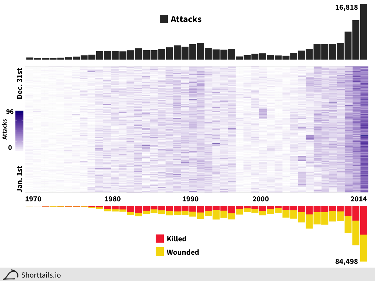
In the figure above we have the years 1970-2014 on the x-axis and the heatmap y-axis shows us the number of terrorist attacks on each day of the year. The barplot above the heatmap gives the total number of attacks each year (over 16,000 in 2014) and the barplot below gives the total number of those killed and wounded in those attacks (over 84,000 in 2014).
The first thing I noticed from this figure is that terrorism is definitely increasing both in number and deadliness of attacks in recent years. Surprisingly though, terrorism had actually been decreasing from a peak in the late 80's and early 90's before this recent increase.
What day of the year is most dangerous?
Another interesting question to ask that is a bit hard to eyeball from the heatmap above by itself, is if there are particular days that are more likely to have terrorist attacks than others. Here we plot the total number of attacks that have taken place on each day of the year:
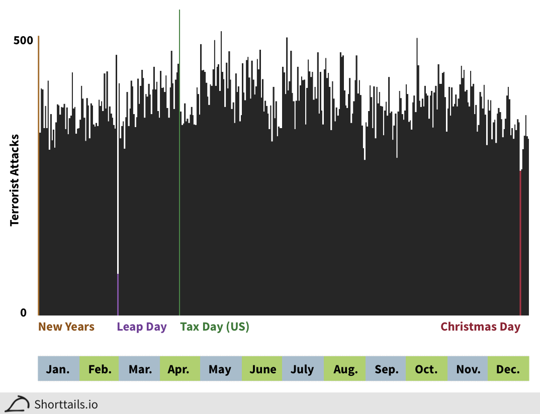
In the barplot above several days of interest have their number of attacks highlighted. Overall there are not any overwhelmingly large diversions from the general trend, but the day with the most terrorist attacks is surprisingly the United States' April 15th Tax Day (green) and the lowest (excluding February's leap day) is Christmas Day (red). New Years (brown) also ranks highly as a day susceptible to terrorist attacks.
We can also break down attacks by day of the week and see that there is a slight decrease in attacks taking place on the weekend (plot here).
Most Prevalent Types and Targets of Attacks
To answer the question of if the qualitative type and target of terrorist attacks has changed over time we can look at line plots of each of these variables:
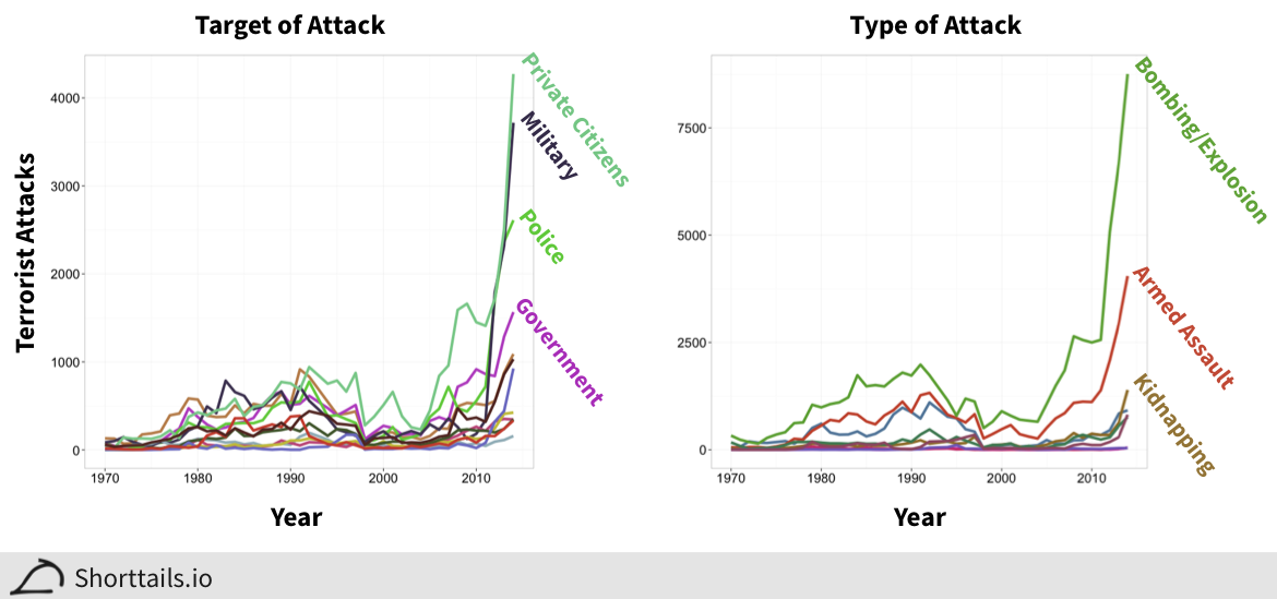
Above, the top targets and types of attacks are indicated.[2] We can see that terrorists most often target private citizens over presumably harder military and other armed targets and that the preferred method of choice is far and away bombings or other explosions. One notable change recent terrorist attacks have from previous ones is that assassinations (blue line in attack type plot) used to be prevalent but are now much less favored.
Terrorist Groups are Getting More Deadly
So far we've seen that terrorism overall has indeed been increasing in both frequency and deadliness over time, but are the same groups responsible for attacks historically ramping up their attacks or are new groups responsible? Are these new terrorist groups more deadly than previous ones? To answer these questions we can look at a heatmap of the number of attacks committed by the 3,168 terrorist groups in this data set from 1970-2014:
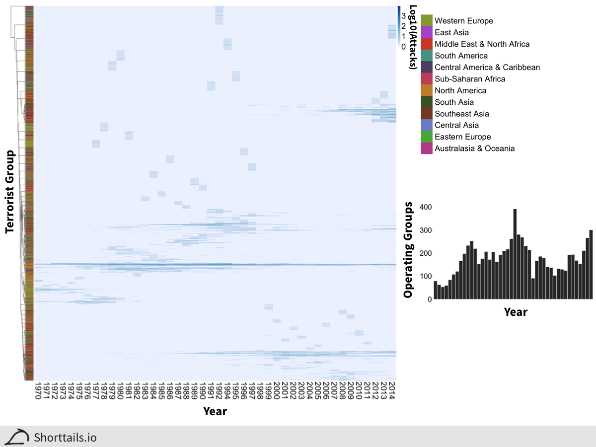
In the heatmap above we can see that the vast majority of terrorist groups are only active (committing attacks) for a single year. Furthermore, most terrorist groups only commit two attacks in over four decades (the overall group attack median).
In the heatmap the terrorist groups are clustered[3] so that groups with similar attack timelines are grouped together. Assigning each group to a region by where their attacks are located does not reveal any striking similarities overall (colored clusters to the left of the heatmap) but there are several instances where, for example, a large set of terrorist groups will operate in a specific region such as Western Europe for a single year (like 1977) and then presumably disband or morph into other groups.
Most interestingly, however, is the fact that if you simply look at how many unique terrorist groups are active in each year (had at least one attack), the year 1992 actually had the most active groups!
Although the number of unique groups has been increasing recently, it has still not matched this previous peak. Seeing as how we saw a drastic increase in the number and deadliness of attacks over the same timespan though it is clear that the groups that are active presently are increasingly more active and deadly than previous terrorist groups.
Summary
This initial analysis has confirmed that it is not just our perception that terrorism has been increasing over time[4], and that there has been a real spike in terrorist activity in the last five years. Furthermore we've seen that:
- Well known holidays such as Christmas seem to influence overall terrorist activity
- Terrorists are targeting ordinary citizens over military or government targets
- While the number of attacks have grown, the number of groups has not kept pace - meaning that the current crop of terrorist groups is more active than their historical counterparts
Further work could break down the types of attacks on each day (for example, is only a certain type of attack less likely on Christmas Day?) and also explore the region specificity of each group more. In particular the data shows South Asia has almost as many terrorist attacks as the Middle East and North Africa, a surprising result considering the focus of most news coverage in the US.
Have more ideas or suggestions about how to use this data? Drop a line at suggest@shorttails.io and maybe it can be added to this blog!
All analysis code available on Github here.
Data Citation: National Consortium for the Study of Terrorism and Responses to Terrorism (START). (2015). Global Terrorism Database. Retrieved from http://www.start.umd.edu/gtd
Credit to Periscopic for the general layout idea, and note that this data does not include the year 1993 (lost in database reorganization) or 896 attacks that did not have a known exact date. ↩︎
Full list of line color codes available here and here; uses the GTD Codebook coding scheme. ↩︎
Note that the clustering distance used here is a binary measure of the proportion of years between groups that if either group had an attack, the other group had an attack as well (since the data is rather sparse - e.g. most groups have 0 attacks in a given year). ↩︎
The GTD database webpage goes into some detail on how the terrorist attacks were ascertained - importantly trying to avoid ascertainment bias issues. ↩︎