College tuition has been increasing at an extraordinary rate since the early 1980s - in fact the percent change in cost over the last few decades (about 1100%) has beat out even medical care in cost increase over time!
Similar to the discussion about increases in medical costs, there is a lot of debate and theorizing about what is driving college costs. Much of it unfortunately seems to fall along partisan lines with some, for political reasons, trying to blame the professorship at universities. These claims that the research and teaching faculty are driving costs don't seem to bear much scrutiny though as low paid adjunct professorships grow more and more common. Another common culprit cited is decreases in college funding from state governments - but this too does not seem to hold up under scrutiny as there is actually more inflation adjusted public funding now than in the 1960s!
So what is driving college costs?
Well, one largely overlooked area is the astoundingly large growth in college administration positions.
Some support for this idea can be found in a report released by the Department of Education itself, which compiles data on what (self-reported) expenses drove the highest tuition increases each year in the US. Indeed, this report notes that additional staff for academic support and student services is at the top of the list[1].
Unfortunately there has been very little quantitative exploration of this idea that administrative growth drives college costs (or college costs in general), so let's explore that now!
College Growth and Administration
To get an idea of which colleges have the largest disconnect between overall growth and administrative growth, we'll use growth in the college's student body and plot the fold change of each from 1987 to 2011[2]:
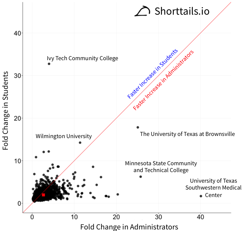
The red line in the plot above is the axis where the fold change in students matches the fold change in administrators, colleges below this line have growth in administration outpacing growth in students and vice versa above the line. The red box is the average for all colleges, showing an overall bias towards a larger increase in administrators!
Interestingly, there are some extreme outlier colleges with huge growth in administration with very little growth in student body, such as UT Southwestern Medical Center. It's unclear what is driving this at each individual college, but we can get a better view of the overall trend by plotting this same plot on a log base ten scale[3]:
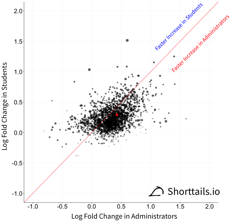
On this log scale a value of 0 now means the same as a value of 1 on our previous linear plot (no growth) and each college's point size represents the log of student body enrollment in 2011. We can see much better now that there is indeed a general bias among colleges of increasing administration at a higher percentage than the student body.
Instead of trying to label all the points on the plot you can download a table of all 2,027 college's values here and we can look at a table of the top 10 colleges with high administrator to student growth ratios - i.e. the colleges where administrative growth far outpaced student growth. Click here (+) to expand this table.
There are six colleges that had ten times or more as much growth in administrators as growth in the student body! Two regions are of particular interest in the above plot though:
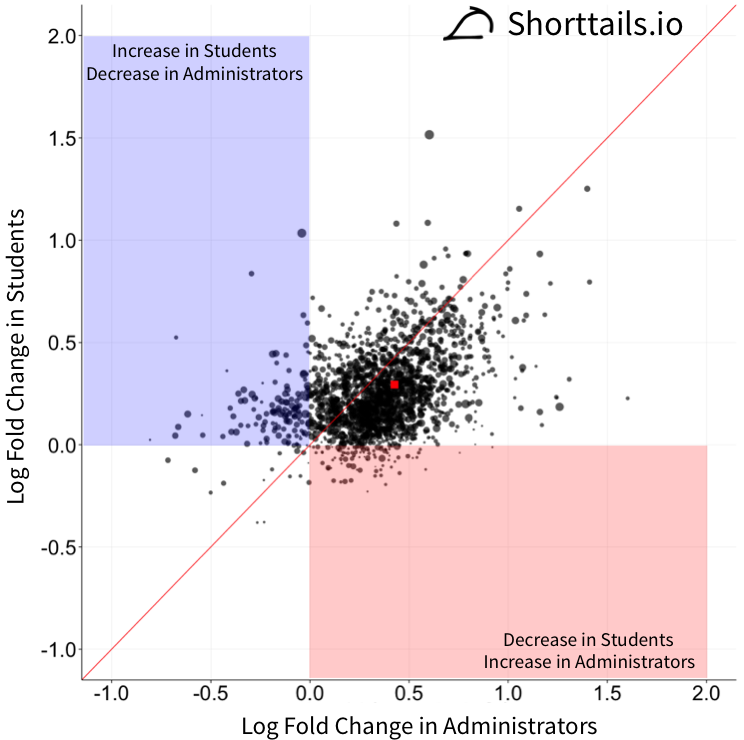
In the blue region we have schools that had an increase in students but a decrease in administrators and in the red region we have schools that increased administrative staff but decreased the student body! Those in the red region such as William Jewell College should potentially evaluate if there are good reasons for this type of growth and those in the blue region like the Philadelphia College of Osteopathic Medicine may have administrative structures that other colleges could learn from.
College Cost and Administration
Seeing as there is a lot of variance in the amount of administrators at colleges and some evidence of excessive administrative growth we can now see if the amount of administrators at a college can tell us something about the tuition price, using data from 2011[4]:
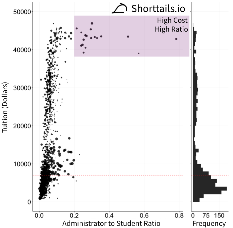
In the plot above the dotted red line indicates the median college tuition, the size of the points is again the log scaled size of 2011 student enrollment and the histogram on the right illustrates the density of colleges at each tuition level.[5] On the x-axis we are plotting the administrator to student ratio to normalize out higher numbers of administrators at a college simply due to larger student body size.
There is a huge relationship between college cost and the number of administrators per student!
Click here (+) to expand a table of specifically which schools fall in the high cost high administrator density purple zone highlighted in the figure (full table of schools ranked by number of administrators per tuition dollar here). This region interestingly has an overrepresentation of Ivy League and similar schools.
So where do we go from here?
To be clear, administrative departments are not increasing nefariously, the reality is quite the opposite - these departments are growing to better serve students, but the unfortunate likely side effect of cost remains and it is one that colleges should evaluate more closely - especially those colleges that have grown their administrative staff more than their student body.
More generally, colleges need to move towards more transparency and quantitative evaluation of what has been driving tuition increases as there may actually be very good reasons for cost increases over time - but these should be openly debated and evaluated by the entire university community if there is any hope for understanding between all the involved parties.
Have more ideas or suggestions about how to use this data? Drop a line at suggest@shorttails.io and maybe it can be added to this blog!
All analysis code available on Github here.
This category specifically excludes any staff involved in instruction. ↩︎
On a log scale, higher values are grouped closer together and lower values are spread apart. ↩︎
Tuition data comes from the National Center for Education Statistics. ↩︎
The tuition density is shown here to illustrate that the trend of higher administrator to student ratios is not driven by there simply being more colleges with high tuitions and thus higher chance of observing these ratios by chance. ↩︎