There has been a lot of interest in the last few years in looking at the correlations between country-wide measures like gross domestic product (GDP; a proxy for economic performance) and child mortality (a proxy for overall health).[1] These types of analyses have revealed a lot of interesting results but one relatively underexplored area is how are country-wide measures like GDP correlated across countries and time?
The answer to this question is exciting because it might allow us to gain some insight on how intertwined the economic fates of countries really are:
- Does growth in the United States mean growth in China?
- When the Russian economy is doing well what does that mean for economies in the Middle East?
A Tale of Two Measures
There are a lot of details involved in economic measurements and caveats that we won't go into here; for simplicity we'll focus on two measures of economic health: GDP per capita and GDP per capita percent growth, both from The World Bank. We'll look at these measures from 1991 to 2013 (minimizing the amount of missing data due to country name changes and revolutions) and also use values denominated in current US dollar amounts.[2]
As we'll see these measures offer some substantial differences in results as GDP per capita looks at the simple changes in absolute value of GDP (more likely to be large for large GDP countries) whereas percent growth lets us look at fold changes of GDP (more likely to be large for small GDP countries).
GDP Over Time
Before we can dive into visualizing the data though, we have some important normalization to do. Since there are potentially broad trends in GDP over time, for example GDP growing in aggregate across countries every year, we want to normalize out these trends so we can better capture the interesting correlations between countries that are not explained by this relatively uninteresting overall behavior.[3] To do so we use a technique called quantile normalization which essentially makes the distribution of GDP values each year the same - meaning that the mean and standard deviation of GDP in 1991 is the same as the GDP in 2013 after normalization.
After doing so we can plot the GDP per capita over time for the 160 countries in our data set:
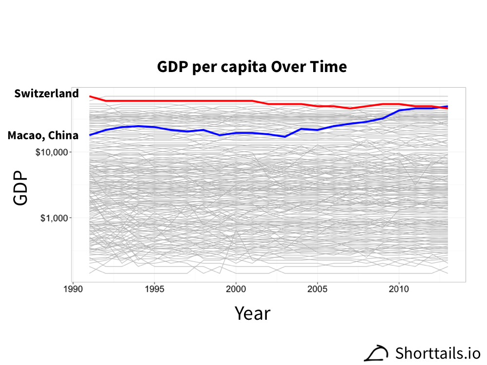
Note that in the plot above we use a log scale for GDP as there are large discrepancies between the largest and smallest GDP countries. We've highlighted the GDP that has most grown over these years (Macao, China; blue) and has most shrunk over these years (Switzerland; red).
What we are interested in is countries or groups of countries whose trends of GDP over time in this plot track each other closely.
Correlating GDP Over Time
We look for correlations of GDP between countries over time using the Spearman correlation which is a rank based correlation and thus offers some protection from outliers in our data.
Plotting all the GDP per capita country pair correlations on a map of the world, connecting the capitals of each country with a line representing the correlation, gives (full resolution available here):
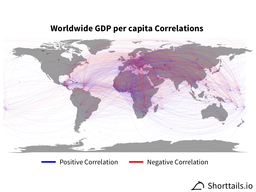
Where in the plot above positive correlations are more blue, negative correlations are more red, and correlation strength is also indicated by line thickness and color transparency. A full list of the pairwise country GDP per capita correlations is available here, but simply looking at the plot we can see some interesting broad trends of strong correlations between economies in Europe.
Similarly, looking at the GDP per capita percent growth correlations on the world map in the same way (full resolution available here):
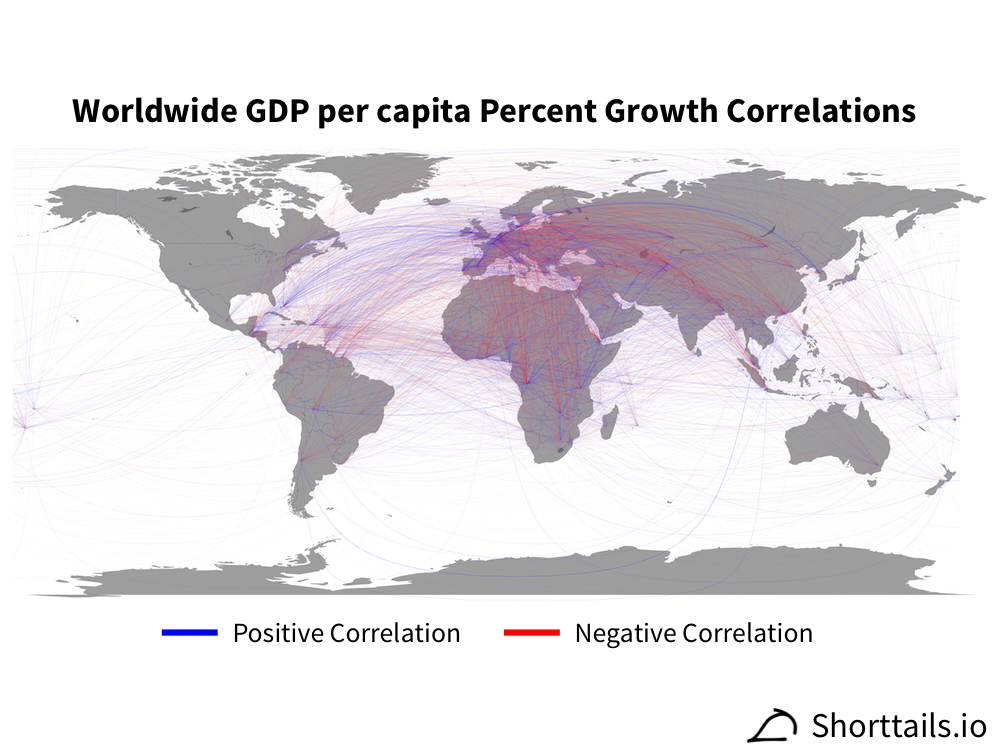
We see that there are now strong correlations between countries in Africa and a lot of negative correlations across the Atlantic. A full list of pairwise country GDP per capita percent growth correlations is available here.
Even with line transparency and thickness adjustments though these plots can be difficult to interpret. Plotting the top ten and bottom 10 most correlated country pairs for GDP per capita percent growth (out of the 12,720 total) gives a much simpler plot:
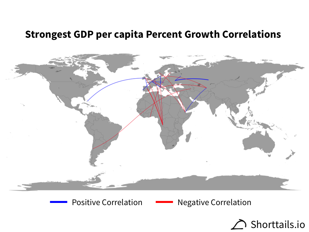
Interestingly, the Democratic Republic of the Congo has very strong negative correlations with many countries in Europe including Spain (strongest), Ireland, the Netherlands, and Italy. Given that Belgium, the Netherlands, and Italy are top destinations for exports from this country this negative correlation could be the result of trade dynamics between these countries.
_exports.PNG)
Mining the Data
The overall strongest correlation between GDP per capita percent growth is between Ukraine and Kazakhstan:
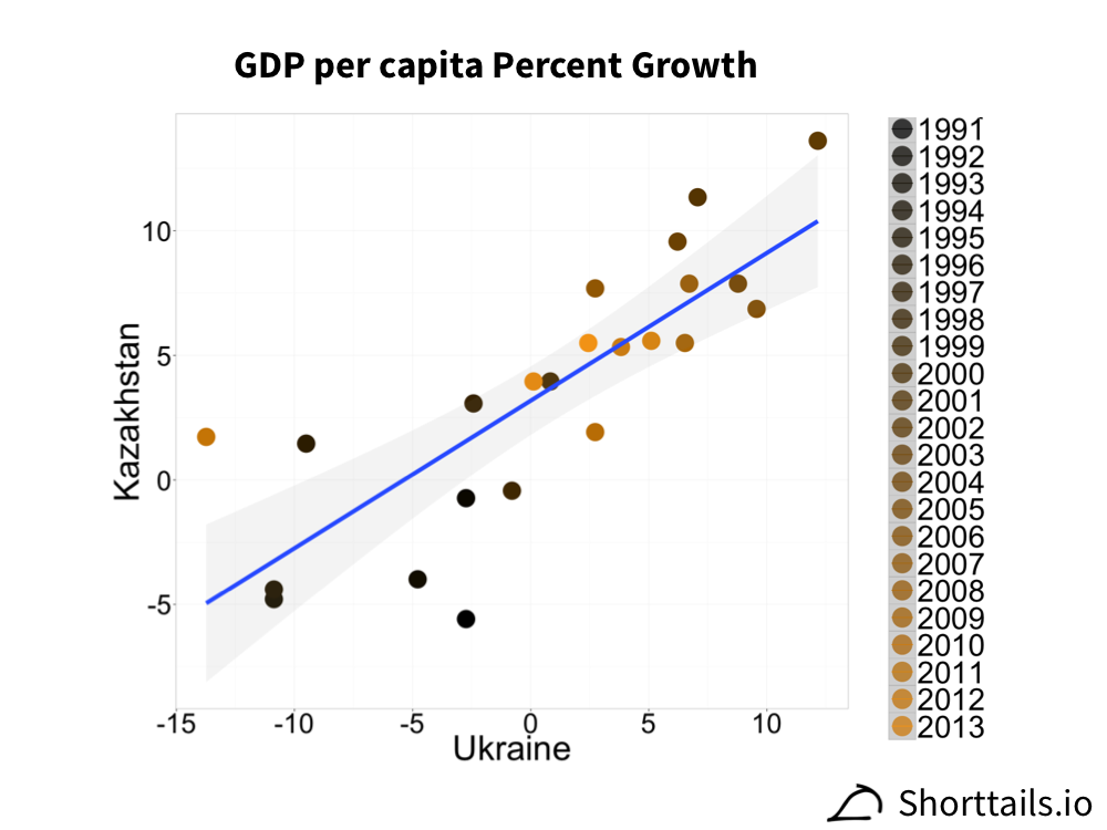
This correlation is driven by a transition from negative and low growth in the early 90s to strong positive growth in the past decade (aside from very recently). Both countries are geographically close and former members of the USSR so it is perhaps not surprising to see such a strong trend. Both countries also have very strong correlations with the GDP per capita percent growth of Russia so it may be that a rising tide does lift all boats in the states of the former soviet republics (and specifically European gas economics might be the tide in this scenario).
Another interesting strong correlation is between The Bahamas and Ireland:
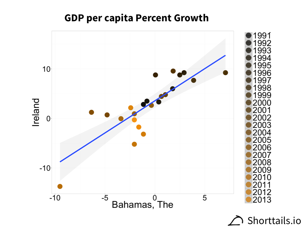
In this case, there have been recent years of poor growth in contrast to previous years of very strong growth. At first this correlation doesn't seem to have much explanation but some digging reveals a potential cause: both countries are well known tax havens and both have faced increased scrutiny in recent years about this practice. If tax shelter activities were a major driver of GDP in both countries it could explain this strong correlation.
One final analysis we can try is to cluster the GDP per capita percent growth correlations of each country so that we can look for groups of countries that have similar global correlation profiles:
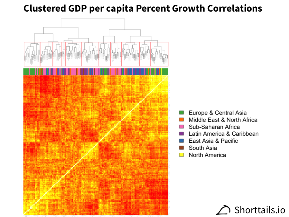
In the plot above we've hierarchically clustered the correlations[4] and also colored each column by the country's region. The dendrogram above the heatmap shows the clustering result and lets us call "blocks" of countries that have similar profiles by looking at the red outlines (the names of the countries in each red block are given here).
Strikingly, there is in particular clustering of countries in Europe and Sub-Saharan Africa - suggesting that these regions have particularly linked economic fates.
Looking into these results a bit more, we can see that the strong correlations of the bottom left (first block) are from the linked fates of the former states of the USSR such as Armenia, Azerbaijan, Russia, and Tajikistan. The block of correlations near the middle of the plot (sixth block) makes a compelling argument for a Chinese economic sphere of influence - with a large set of countries mainly in Africa in South America whose GDP per capita percent growth tracks closely that of China. Additionally we see this Chinese sphere of influence strongly negatively correlates with the adjacent block (seventh block) which consists of mainly countries from the Caribbean and Europe - suggesting potential tradeoffs between the growth of these countries.
There are a lot more avenues that can be explored with this data but that will be left for a future blog post and the data is available for public download on github!
Have more ideas or suggestions about how to use this data? Drop a line at suggest@shorttails.io and maybe it can be added to this blog!
All analysis code available on Github here.
See Gapminder for an easy way to explore these types of (super interesting) correlations! ↩︎
This way inflation will not cause us to see spurious correlations. ↩︎
E.g. We will see positive correlations between many countries' GDPs simply due to increasing worldwide economic output. ↩︎
The data and clusters are mirrored on each side of the diagonal since the correlation does not depend on the pairwise order. ↩︎