Political spending has been steadily rising each election cycle and it's likely this trend will continue with the upcoming presidential elections; so each year it becomes more and more important to understand exactly how this money enters our democratic process and how it influences it.
There has been great work at places like MapLight to analyze issues such as how money source correlates with representative's votes, but there has been a notable lack of analysis of the ties between candidates that can be revealed by election year contributions. From this type of analysis we could potentially learn:
- Which candidates have the closest contribution profiles?
- Are there groups of candidates with close ties?
- Are there significant across the aisle correlations in campaign contributions?
To answer these questions and more we will use Federal Election Commission (FEC) data from most expensive election in history, the 2012 US presidential election cycle.[1]
Following the Money
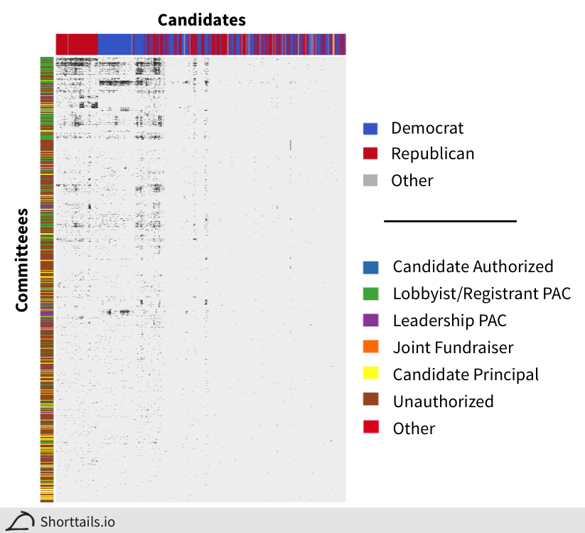
Above we have a binary heatmap (black is a contribution, grey is no contribution) of which committees made contributions to each candidate in the 2012 election cycle.
The first decision we have to make is how to quantify contribution associations between the candidates. As you can see the by far most common scenario is that a committee did not donate to a candidate (grey), so if we used a naive correlation measure like the Pearson correlation we would find all candidates are highly correlated simply because they share a large number of committees that did not donate to them!
So we need to choose a measure that gets at what we really care about when comparing two candidates - namely what committees donated to both candidates out of the committees that donated to either candidate (committees that did not donate to either do not affect our calculation). This type of correlation is called the Jaccard index.[2]
We've calculated this Jaccard coefficient between all the candidates and clustered the columns (and rows) of the binary heatmap based on them in the figure above. As you can see our associations naturally form four candidate groups (from left to right): Republicans, Democrats, Mixed, and Sparse.
Also, as expected, committees created to serve a single candidate (principal) do not link many candidates together (bottom of heatmap, yellow) whereas lobbyist PACs strongly link politicians together (top of heatmap, green).
Using permutations of our data to determine significance[3], we can also create a list of all significant associations between candidates, available in full here and the top ten shown below:
Click here (+) to expand table.[4]
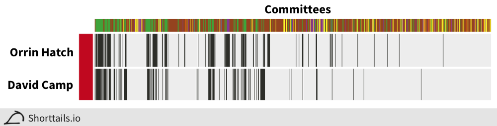
Interestingly, the vast majority of candidates (82%) had at least one significant association with another candidate, with the strongest association being between the Republicans Orrin Hatch and David Camp:
And the top association between two Democrats is between James Clyburn and Steny Hoyer:
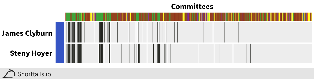
Anecdotally, the strongest associations appear to be between candidates who have held leadership positions in their parties, suggesting that such positions often bring with them the same set of committee contributions.
Across the Aisle
Perhaps most interesting though are the "mixed" or "across the aisle" links as we somewhat expect members of the same party to have the same contributors but we don't necessarily expect this across party lines. Here are the top ten such links:
Click here (+) to expand table.
The strongest across the aisle correlation is between Kevin McCarthy (House Majority Leader) and Steny Hoyer (former House Majority Leader):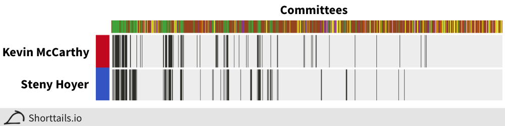
One thing you may notice if you look at the full data is that across the aisle associations seem to be more common with incumbent candidates than challenger or open seat candidates - looking at the median Jaccard coefficient for each type of pairing further confirms this suspicion with a median of 0.11 for associations between incumbents and a median of 0.06 between incumbents and challengers.[5]
To evaluate this idea further, we can cluster the candidates by their Jaccard coefficients[6] and create a symmetric heatmap with the candidate's party on the columns and the candidate's incumbency status on the rows:
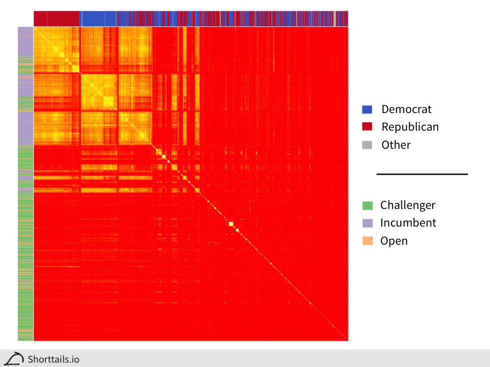
We see that there is extremely strong clustering for incumbents! Especially interesting is the mixed group of Democratic and Republican candidates that are more clustered with each other than with their main party groups and almost entirely consists of incumbents.
There is also a compelling case for "institutional challengers" (green) who group in funding with the incumbents (purple) of their party as opposed to the "outsider challengers" who receive separate funding.
Money Talks
The next question to ask is if these contributions can really tell us about how candidates will vote, and as it turns out this looks likely to be the case!
For example, there is a single Democrat, Henry Cuellar, grouped with the main block of republicans in the heatmap above (far left) - visualized with his strongest Republican association here:
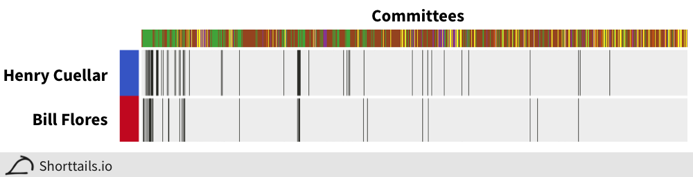
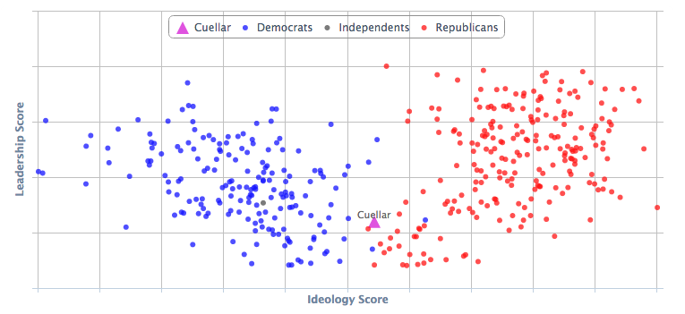
We expect Cuellar to lean Republican ideologically - and in fact we see that is the case using data from GovTrack.us:
In addition to further pursuing these leads, there are a lot of other exciting avenues for exploration, like using techniques from graph theory to identify "node" politicians who link parties both internally and externally and predicting bill cosponsorship based on contribution similarity.
Evaluating these questions helps us better understand the forces influencing our democratic process and allows us to be more informed about a major hidden factor influencing the relationships between our politicians.
Have more ideas or suggestions about how to use this data? Drop a line at suggest@shorttails.io and maybe it can be added to this blog!
All analysis code available on Github here.
Data from the FEC (2011-2012 cycle). ↩︎
More formally, the Jaccard distance is the length of the intersect between two vectors divided by the length of the union. We could also have chosen measures like the mutual information but the Jaccard index has a nice intuitive rational here. ↩︎
Here we use a false discovery rate (FDR) of 5% based on 1,000 permutations where the columns of the data are randomized separately and associations are recalculated. ↩︎
Here Coef. is the Jaccard coefficient, Qvalue is the FDR (i.e. if this association is called significant what is the FDR), Cont. is number of contributions, and Type is the incumbency status. ↩︎
A difference significant using a Wilcoxon test at p < 2.2e-16. Also note the median between challenger association was 0.07. ↩︎
This heatmap displays a started log base 10 of the Jaccard coefficients for easier visualization (clustering was done on the untransformed values). ↩︎