US foreign aid is a hot topic, especially during presidential election cycles like the one we are entering now.[1]
Typically the conversations and debates about foreign aid focus on how much aid a particular country has received in the previous year or is going to receive in the coming year - with surprisingly little analysis done on the long term trends of where US aid has gone! Doing so could help answer some interesting questions:
- Has foreign aid allocation shifted with shifting policy goals?
- Are there any surprising winners and losers of aid over time?
- What countries have highly correlated aid over time?
To answer these questions and more let's look at the past decade of foreign aid data (2006-2015) as available here.
Where does foreign aid go?
First, let's look at the total amount of foreign aid given each year:
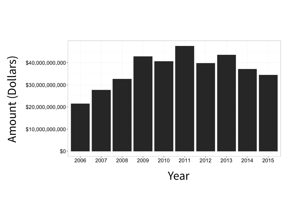
As you can see the raw total amount of foreign aid distributed was highest in 2011 and has gone down since then (also note there has been a small amount of inflation over these years, so its even more surprising that overall aid has gone down).
Since it could be easy to get misled by just looking at the raw amounts of aid[2], from now on we'll look at the percent of aid that each country received per year (basically a measure of how countries are prioritized for the limited aid available each year).
Doing so yields some striking results:
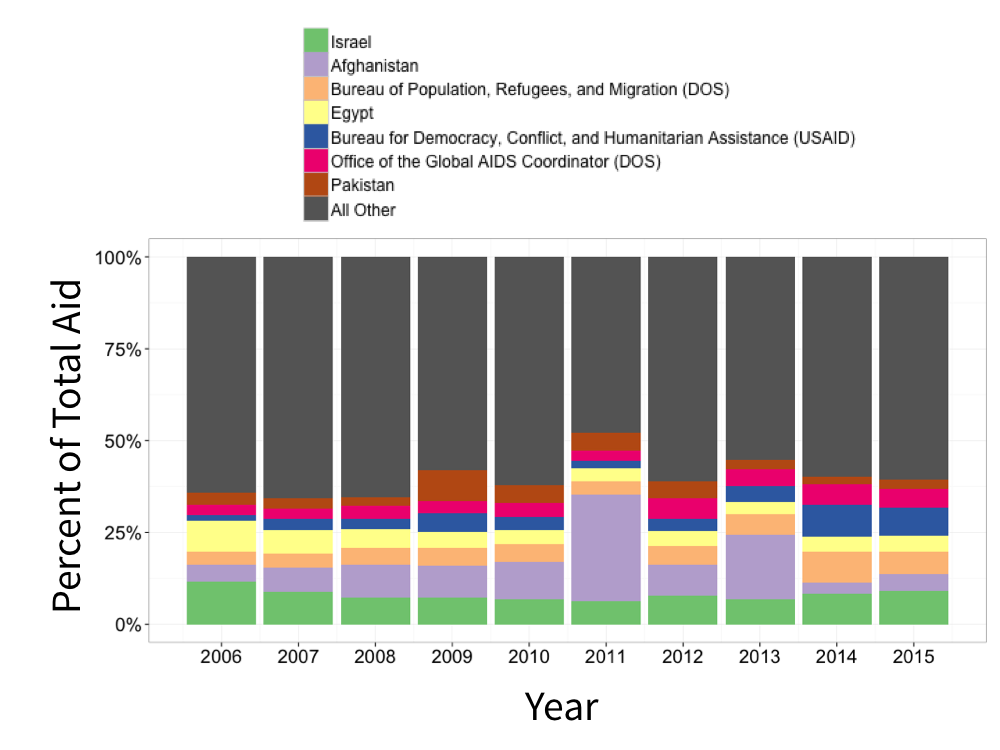
Countries like Israel, Egypt, and Pakistan have fairly consistent levels of aid each year whereas Afghanistan was a big beneficiary in some years like 2011. Also note here that our data includes both specific countries and also more general offices and bureaus like the Office of the Global AIDS Coordinator (DOS) whose funds benefit a variety of countries and regions (both directly and indirectly).
Let's see if we can break down these results more by collapsing the data using some statistical techniques.
What countries have similar aid profiles?
We can also simplify the data and view it in on a simple 2D plot using a technique called PCA:
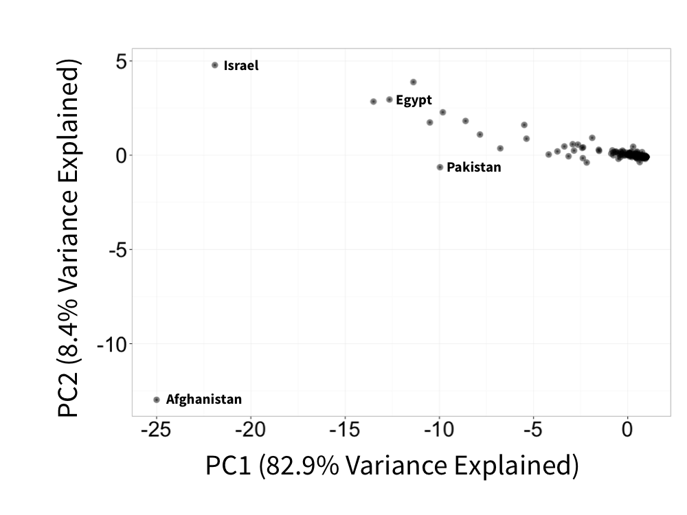
Above we've chosen the two axes that best capture the variation in aid over time (with the first axis explaining 82.9% of that variance) in 2D and then plotted each country as a point on these axes.[3] Countries that are closer together on this plot had more similar profiles of aid over time (and vice versa for those further apart). As expected from our barplot of aid over time, the first axis that explains most of the variance separates Afghanistan from all other countries - this country is a big recipient of aid and had a large variance in the amount of that aid it received over time.
Interestingly, the second axis separates Israel and Afghanistan, suggesting that when one country had increased aid the other had a corresponding decrease.
We can also look at the relationship between the years themselves (e.g. was the foreign aid profile of 2008 similar to that of 2015?):
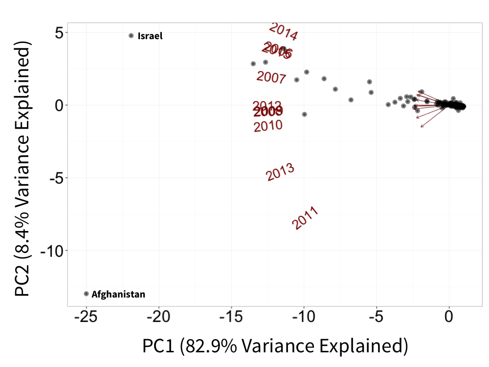
Here, vectors pointing in the same direction represent years with similar foreign aid profiles and the vector's direction is towards the countries that had the highest percent foreign aid that year.
We can see that the most different years are 2011 and 2014, mainly driven by the fact that in 2011 Afghanistan received a huge percent of total aid whereas in 2014 it receieved a tiny percent.
We can also plot additional axes that explain ever decreasing variance:
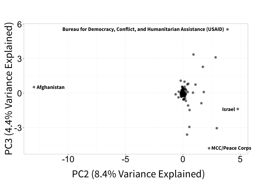
Here we can see that the third component separates a USAID bureau and the Millenium Challenge Corporation (MCC)/Peace Corps, suggesting that aid for these two agencies comes at the expense of each other.
Who are the biggest winners and losers?
Perhaps most interesting though is what countries and agencies have been the biggest winners and losers of US aid dollars over time.
We can look for these countries by simply correlating each country's percent of total aid for each year with time. Then we can plot the top 5 most increasing (blue) and top 5 most decreasing (red) aid receiving countries:
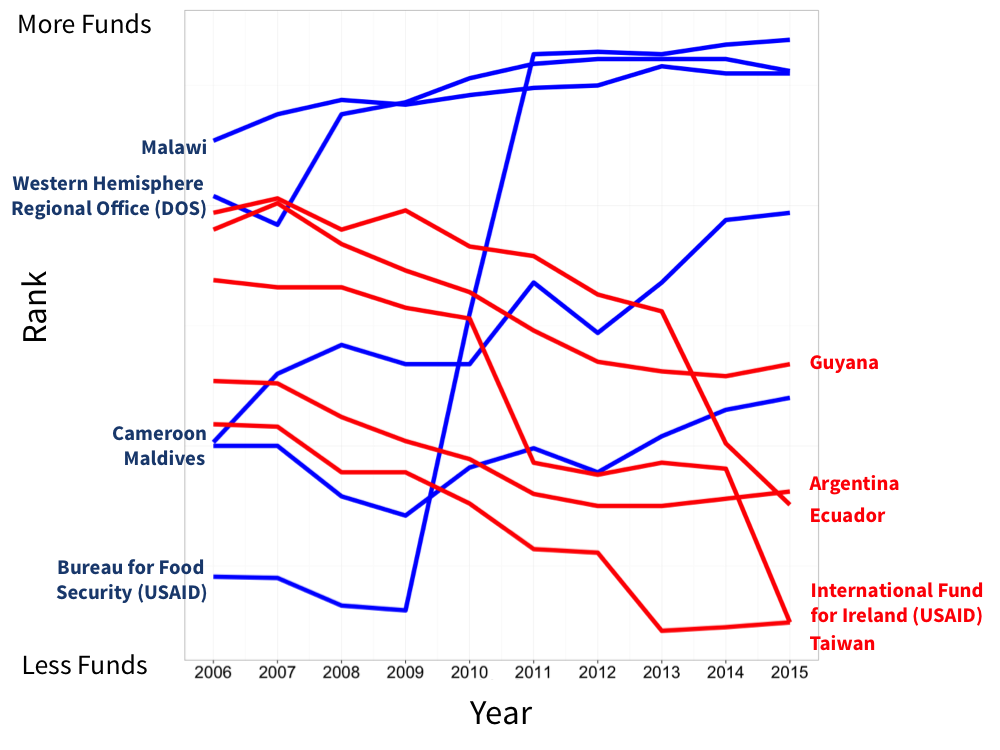
Note that above we are plotting the ranks of each country for each year whereas the correlation was done with the raw percent values. The full list of countries and bureaus ordered by correlation is available here.
This analysis yields some results that make intuitive sense - such as a decrease in aid to Ireland and Taiwan as US focus shifted elsewhere. But also some surprising resuls, such as the strong increase in aid to Malawi, Cameroon, and the Maldives. A particular winner is the Bureau for Food Security, a bureau created in 2010 by the Obama administration whose Feed the Future initiative supports agricultural development in developing countries.
We might see these increases and decreases in percent aid over time by chance though, which would make them less interesting. To check that we are seeing correlations beyond random noise a simple permutation of the data by year (shuffling the order) was done many times, the resulting correlations from the random shufflings are in blue and the real data is in red:
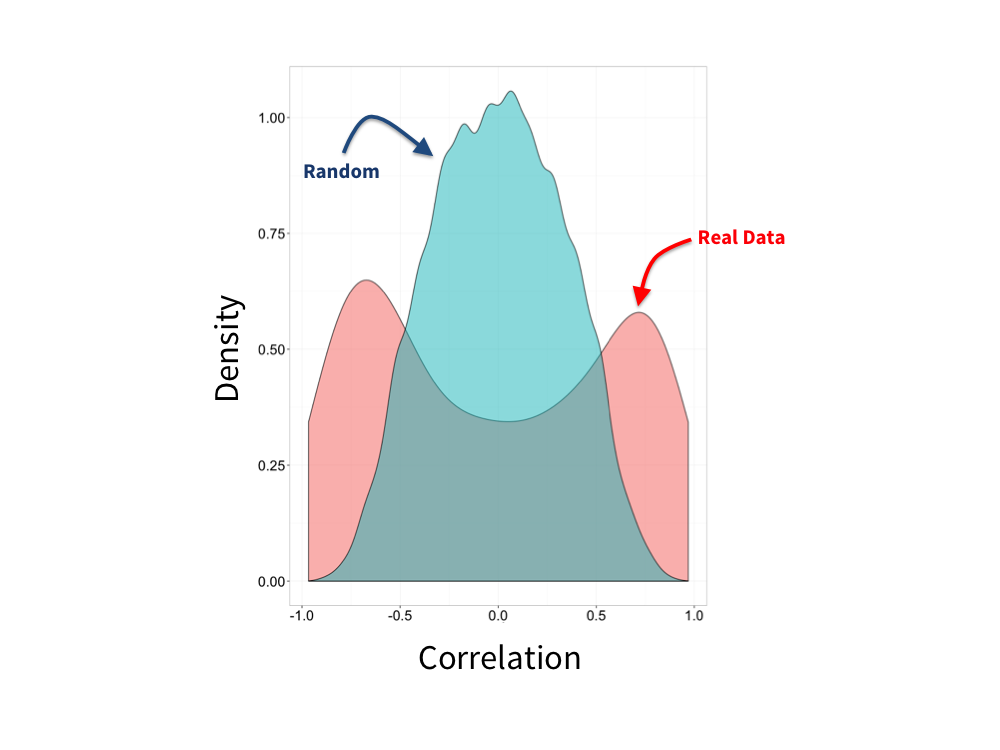
As we can see we observe much stronger extreme correlations of percent aid over time than we expect from random reorderings of the years, giving us more confidence that these are not spurious associations.
Has the type of aid shifted over time?
Another interesting plot to look at is how the type of aid has shifted over time:
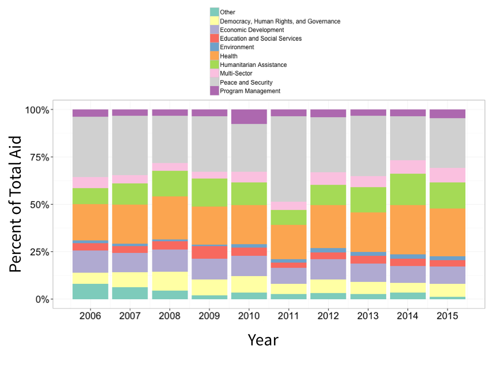
We can see that Peace and Security increased substantially in 2011, likely corresponding to the increase in aid to Afghanistan for this purpose. Additionally, the allocation for program management was essentially doubled in 2010 compared to other years for unknown reasons.
Have more ideas or suggestions about how to use this data? Drop a line at suggest@shorttails.io and maybe it can be added to this blog!
All analysis code available on Github here.
Even though only ~1% of the US budget goes towards foreign aid. ↩︎
For example, if the total amount of aid increased every year then it is less interesting to see individual country aid allocations increase every year. Looking at percents instead of raw values also lets us account for inflation. ↩︎
The principal components are linear combinations of each year's aid data. ↩︎